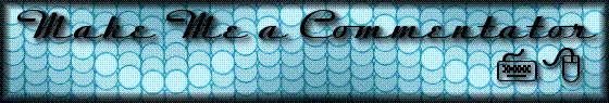
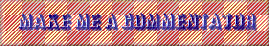
A Century of Logos
Over
the time I’ve had this website I have designed several dozen logos for the top
there, as well as done other artistic type things from time to time. This is a gallery of such images with a bit
of commentary as well. Enjoy!
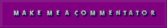
The Early Days
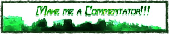
This
was the first logo (I think), and it’s not that inspiring in my mind.
![]()
The
following two were drafts for a second logo – the butterfly was downloaded from
Google, and is not my design. Gleefully ripped off.
I don’t think I actually used the first one.
![]()
![]()
This
is more of a classic design, and stayed up for quite a long time.
![]()
This
one relates back to the lamp pictures, which will have their own gallery, so
look for commentary there. But it’s not
bad looking.
![]()
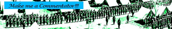
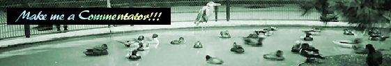
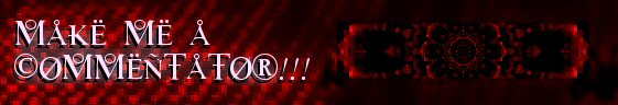
This
is of course our commentary button. I’ve
never felt the slightest urge to change this one – just really like the way it
looks. It’s taken from a performance of Lysistrata up on the capital steps in my town.

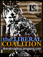
I
am not taking credit for the Liberal Coalition logo – I can’t say who designed
it for fear of getting it wrong, but they did a bang up job. I will take credit for the two “alterations”
below – I think the Blue Green one actually appeared on the site.
The Glut
Sometime last year I got
the idea that it would be fun to update the look of the website on a weekly
basis and have new logo’s constantly. It proved a doable idea. Naturally this required a glut of logos, most
of which were done over a fairly short period of time. The first 8 or 9 were done on the same day,
and frankly it shows.
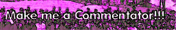
I
kind of like this one for sentimental reasons, but it’s not all that
exciting.

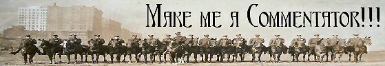
I
actually was a little hesitant to use this one, because of the military connotations. The first draft had it in stark yellow and
red, which was a bit more striking. I
eventually softened it to these colors.
This is one that Space Lobster and McIckleson
quite like. Incidentally the picture for
this one, the one above and many of them really comes from a collection at the
Library of Congress Website, entitled Panoramic Photographs - Taking the Long View, 1851-1991. Really great for browsing.
I
also really like this one which was sort of an accident.
This
one on the other hand used very similar techniques to the one above, but didn’t
turn out nearly as creatively. There’s a
lesson there about trying to replicate an accident. I don’t know if I’ve actually used it or
not.
This
is a very simple one – just a panoramic picture made a little bit more warm,
squished and with words at the tope. I
like that font though.
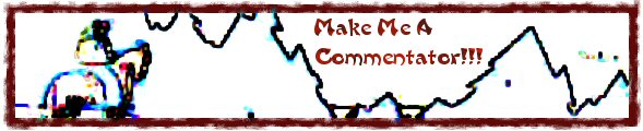
This
was a surprisingly difficult one for such a simple effect at the end. If you look at the left side of the picture
you can get an idea of what sort of picture I started with.
I
have a weird affection for this one – partially because of the strong font, and
partially because it kind of has a 1950s/1960s futuristic look to it. Jagged.

Everybody
likes ducks right? Actually this would
be a good logo for a website called “A Parliament of Ducks.”
I
really like this one too – just has a really 1950s/1960s futuristic feel to
it. I liked it enough to use it even
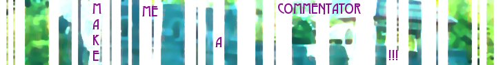
though there wasn’t room for the three exclamation points.
This
is somewhat of a stark visual – the background is a poster from the WPA, I
believe.
This
is also originally a WPA poster, cut to fit today’s lifestyle. I like the font here too, actually.
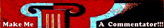
A
weird one redeemed by a cool font. It’s
kind of dark looking.
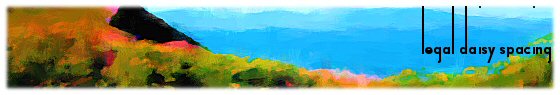
I
like everything about this logo – the background the font. It’s very soothing. Of course you will note that the name is
different. After the election last year
I was a bit down (to put it mildly), and so I decided to take a week off from
being Make Me a Commentator!!!. Instead for a week we were Legal Daisy
Spacing (name suggested by Random Goblin); which was fun enough. It was shortly after that that I lost control
of the blog – although that happened behind the
scenes of course. The “new” management
didn’t really affect the visible aspects of the blog
until much later.
I
hate this one – but it was done quickly.
I’m
not much fonder of this one – the font is good, but it’s still kind of
dull. I’m running out of ideas.
This
one partially redeems me – I like the circles and the kind of computer
look. What’s interesting is considering
what sort of blog this logo would be attached to
(ignoring the title and the fact that you know what kind of blog
it is). Just based on the design scheme
what sort of blog should this be? Then do the same experiment with Legal Daisy
Spacing logo above. Or the one with the
jelly fish on it.
![]()
Gosh
this looks familiar. I think I tweaked
the shading a bit, but it’s still kind of dull.
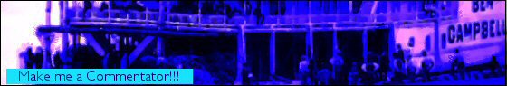
This
isn’t very creative but it looks ok. I
think mostly I loved that boat picture and wanted to do something with it, but
couldn’t figure out a way to get the text in with such a busy background. So I did the standard compromise. I’m not sure I’ve actually used it, the words are hard to read.
Oh
how I hate this one. It was an attempt
at a Christmas Logo gone horribly wrong.
I used it anyway.
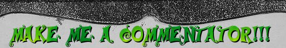
The
very first appearance of the Monster! This
logo was suggested by Random Goblin; and we will cover his involvement down
below.

I
kind of like this one – kind of Tron Themed.
Outside Influence
About this time I had a
friend who was also experimenting with Paint Shop – so I enlisted her help in
creating logos (as my wells of creativity had run a bit dry. I don’t have as much commentary about these,
though – but they are very nice looking I think.

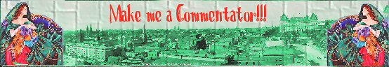
A
very nice one here – it appeared on the blog for a
little spell, actually.

Once
Random Goblin saw that we accepting submissions he sent in this one which
involved the monster. The logo we
couldn’t use due to it’s violent message, but the
Monster we liked and kept. And kept some
more. And now he runs this website. It’s a funny old world sometimes.
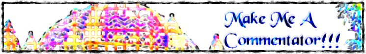
The New Age
Which
brings us to the most recent period in the sites history – as you all know I
lost control of this website back in late June, and it was handed over to
Cheery Jetson and Grumbly
Muffin for the duration (with McIckleson and later
Space Lobster). Since then, the Monster
cleared matters up and assumed control of the website – and now we all work for
him, more or less. While the website was
under new management they adopted a new format, which we have since abandoned
because it did not allow for linking to individual posts. The new format encouraged larger logos and
some really creative work was done, mostly by Cheery.
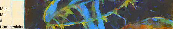
I
really like this one (by Cheery) – it combines a lot of cool things. I particularly like how the lettering kind of
shades its way in.

This one is perhaps a
bit dark, but it’s kind of cool looking too.

This is another Cheery
one and it’s wonderful – very colorful.
This one I did –
actually it was done very quickly. I had
already done the fuzzy spiral, so just pasted it in and put the title to the
left.

The following two titles
were designed by Cheery, but with the return to the old format I don’t know if
we will get to use them in this form. We
will likely have to trim just a little bit – but we will use them because they
are very nice. The bottom one is mine,
and I kind of like it, mainly because it’s a little different. But the title is hard to read.


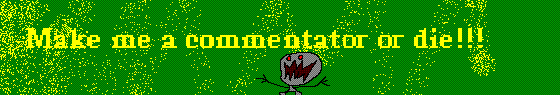
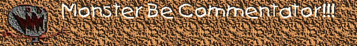
This
logo was used for a week when the Monster took over. He considered leaving the title of the blog Monster Be Commentator!!! But we talked him out of
it.
And
this is what we have up for our first week back to the old system, designed by
my friend who did the logos above.
And that brings us to
the end of our little journey. For those
of you who feel this was a little self indulgent, well, consider what you paid
for it and go in peace!